
Want to hit success with mcommerce? Here’s what you need to know about mobile customer account pages.
eCommerce businesses are always-on. Your customers shop at any time of the day or night, as well as from anywhere – home, office, or when they’re on the road.
And so, you have to ensure your Shopify store is 100% mobile friendly. Not just your home page and product pages, but even your Shopify customer account page.
The customer account page is the second most-visited page on eCommerce sites after the home page. But given that the screen space is limited, how should you ensure you optimize your mobile customer account page?
We’ll tell you how to do that.
What are mobile customer account pages?
Mobile customer account pages are nothing but the customer account page of an ecommerce site that is mobile-friendly. Meaning your customers can log in to your online store from their mobile devices. Not just that, they should also be easily able to access all the features on the customer account page from their mobiles.
Some of the best examples of mobile customer account pages are from eCommerce giants such as Amazon, AliExpress, Walmart, etc.
Here’s an example of AliExpress mobile customer account page:

Why is it important to have mobile customer account pages?
Consider these statistics:
- 79% of smartphone users have made a purchase using a mobile device in the last six months
- It is estimated that the global retail mobile ecommerce will make up 69.9% of total retail eCommerce sales
With the number of mobile users increasing, a steady increase in eCommerce businesses, and a growing preference for mobile shopping among consumers, it’s a must for your Shopify store to have a mobile store.
And just like your website, one of the most important pages of your mobile site is your customer account page. Whatever actions your customers perform on your site via the desktop version, they’d want to do the same on your mobile site too.
There are many benefits of having a customer account page:
- Customer account pages help build customer loyalty
- They help you personalize customer experiences
- Customer account pages are a gold mine of customer data
- Data collected from different sections can help you in future promotions and sales
- The customer account page is the go-to page for your customers
- Most customers expect a customer account page because it’s safer and more secure for them to make purchases after logging in
- Customers’ personal details are more secure and safe within a customer account page
By having a mobile customer account page, you can ensure:
- Your customers can conveniently and securely shop even when they’re on the move
- Since customers can shop anytime, it boosts your sales
- More customer log-ins equals to more data for your business
- More data means you can create personalized and targeted campaigns
- With most eCommerce stores providing mobile customer account pages, it’s a must-have to beat competition
How to ensure a good experience on mobile customer account pages?
The 2021 mobile commerce sales in the US alone exceeded $360 billion. It goes without saying that for eCommerce websites, it’s a must to optimize their sites for mobile devices.
If you run a Shopify store, you’re already in good hands. Shopify has many themes that are responsive on mobile devices.
But optimization doesn’t stop at responsiveness. There are many more factors that you should get right to ensure a good experience when customers log in to your Shopify customer account pages via mobile.
And so, one of the first things you should optimize for mobile is the customer account page. We’ll tell you how to do that.
#1 Make sure the customer account page fits the small screen design
Hand-held devices have a smaller screen compared to desktops. Hence, it’s important to create a mobile customer account page design that fits in the small screen. But that doesn’t mean you should compromise on the features.
Here are some tips you could implement:
- Make buttons easy to tap without having to zoom in. Since the mobile device screen is small, if the buttons are too small, customers might end up clicking the wrong button and that can get annoying. Hence the buttons of the mobile customer account page should be big enough and have some blank space around them.
- The text should be legible. Make sure you don’t make your customers zoom in or scroll left-to-right to read the text on your mobile site. It’s simply a waste of time and annoying and can lead to customers leaving your mobile site.
- Make sure your mobile customer account page design is simple. Mobile doesn’t give enough space to have too many tabs or complicated navigation. Hence, keep the design and navigation simple.
- Make the best use of call-to-action buttons. Make them stand out. Place them where customers can see them clearly. Make them easily clickable.
Here’s an example of The Man Company mobile customer account page:

#2 Keep the navigation on the customer account page simple
You may have the urge to replicate the navigation of your desktop version of the Shopify customer account page in your mobile customer account. But if you have complex navigation, it might backfire. This is what could happen:
- Your customers might get lost in the different tabs and sub tabs
- This might make customers easily leave your site and increase the bounce rate
- As a result, there might be more cart abandonments
Here’s how you should tackle navigation for the small screen:
- Sort the different sections of your customer account page
- Segregate important features/sections and less important sections
- Keep only one layer – the most important features
- Review and test your navigation structure and make changes
- To make the customer account page look neat on the small screen, make menus invisible. You could use icons that can collapse and expand when customers click on it
Here are some icon examples:

#3 Focus on the text of your customer account page
As important as design and navigation, is the text on your Shopify customer account page. You may assume that there’s going to be minimal text on this page and hence, it’s nothing to worry about. But, that’s not the case.
This page will carry a lot of information; all the important information that your customers might be looking for. Think FAQs, return/exchange policy, personal details, etc. You’ll need to give as many details as possible, but in less text.
Here are some factors you should consider to use text:
- Make sure the font is large enough and easy for customers to read. Don’t make your customers zoom in. Small fonts are hard to read and may put off customers.
- Use conventional fonts. There are two main reasons for this. Customers are used to reading conventional fonts such as Arial. Another reason is, customers might not have the fancy font you have and might need to download it on their phones to be able to read the text. They might not want to go through this process and leave the site.
- Keep text to the minimal. Since the screen is small and space is less, you should try to share as much information as possible in fewer words. One way to deal with this is to have read more… and read less… options.
#4 Give importance to the call-to-action button
Even though the mobile customer account page for your Shopify store holds all the important information that customers can easily find in one place, the page has a much bigger purpose — conversion or to drive customers to take favorable actions. That’s where the call-to-action (CTA) button comes in the picture.
Again, since your mobile customer account page is small, you don’t have a lot of space to add many CTA buttons.
But what kind of CTA buttons might one have on a customer account page, you might wonder. Think ‘buy now’, ‘reorder’, ‘redeem points’, etc.
Here are some best practices for the CTA button/s:
- Your CTA button would depend on your goal, and hence should keep changing them if your goals keep changing
- If you don’t have enough space, have a fixed CTA button for all sections in your customer account page
- Keep the CTA prominently displayed at all times in the customer account page
#5 Keep the main navigation bar static
As we learnt in point #2, you should keep the most important features in your navigation bar. These features are most probably the ones that customers would use more often. For example, order history, address, card details, loyalty program, etc.
But why so? Because your less important features might distract your customers. As a result you may not achieve your goals from the customer account page.
For example, say your goal is to increase reorders. But instead of having a reorder button, you give prominence to other features such as recently viewed products. Your customers might get pulled into the recently viewed products, and may forget about the reorder tab.
So here’s how you can make the most of the navigation bar:
- Always keep the navigation bar in sight in the customer account page
- Have the most important features in the navigation bar
- Make sure you have one CTA
- Make sure you have a link to the home page in your navigation bar. This will keep customers on your site for a longer period
- Customize your navigation bar with your brand colors, font and website theme
Here’s an example from Flits customer account page app:

#6 Make your mobile customer account page comprehensive with many features
Even though the space is less and you’d want to give prominence to your most important features, as we discussed before, you can’t afford to ignore the other features. They are as important as the main features.
Hence, make sure you have all the important features such as:
Reorder: You can boost reorders on your customer account page by adding a ‘reorder’ button in your mobile customer account page.
Social login: Increase the number of logins and reduce the number of cart abandonment by allowing social login on your Shopify store’s mobile customer account page.
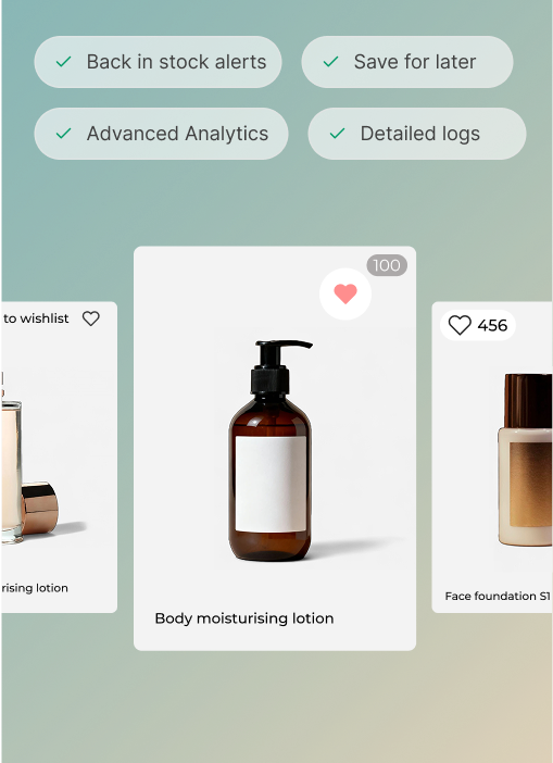
Wishlist: Let shoppers add items to their wishlist while browsing your mobile site while they’re on the go. You can entice them to buy the products later by sending discounts and deals.
Store credits: Make loyalty programs and store credits a prominent part of your customer account page so customers can see how they can earn more points or use the credit points they’ve accumulated.
Recently viewed products: Allow customers to see the items they viewed recently. This helps boost sales and makes customers experience better.
Here’s how you can make sure you make your customer account page comprehensive:
- Keep the top layer in your navigation bar for the most important features
- The other features can be hidden in an icon and show only when customers click on the icon
- Choose a Shopify customer account app that allows easy integrations, responsiveness, and customization abilities
Here’s an example from Amazon’s mobile customer account page:


Should you have a mobile customer account page for Shopify?
If you want to maximize the returns from your Shopify store, you shouldn’t ignore a mobile customer account page. However, just having a mobile site and customer account isn’t it. You’ll have to optimize your customer account to gain the maximum benefits out of it.
And for that you need the Flits customer account page app. The app comes with advanced capabilities to create a mobile responsive Shopify site.
Flits offers advanced add-on features that can help you optimize customers shopping experience and boost your business targets faster.


