
Unwrapping Shopify polaris and our experience of redesigning Flits
In 2017 Shopify introduced Polaris to the world during the Shopify unite event. Polaris is a design system that includes a new UI for all its products to create a unified aesthetic across web, tablet and mobile interfaces. The UI Kits are also available for Shopify Partners, enabling app developers to create UIs for their own admins that are more consistent with Shopify, resulting in a smoother experience for merchants.
Shopify Polaris design system is a testament that Shopify stays true to its mission of making commerce better for everyone. It was important for Shopify that their products were usable and valuable to all the users and consistent across all users’ touch points.
The end goal was to ensure all Shopify products had the same design principles and language. An in-depth design system was important to ensure this. Design systems change and evolve with time but we can say this with conviction that Polaris system is the perfect start.

Features of Shopify Polaris
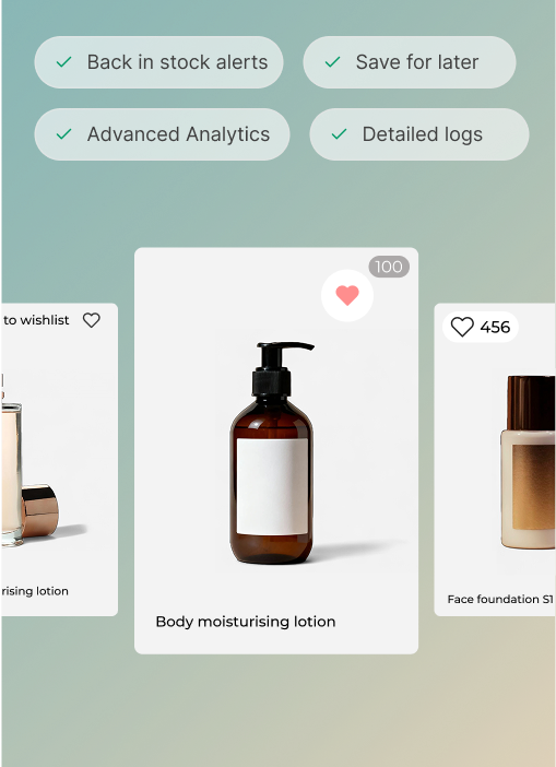
Polaris is a design system created by Shopify that provides a consistent visual style and user experience for various Shopify products and services.
Some of the features of Polaris include:
- A set of design guidelines and principles to help create a uniform and intuitive user experience across all products and services of Shopify.
- A library of UI components and patterns that can be used to build user interfaces quickly and efficiently. These components are designed to be flexible and customizable, so they can be easily adapted to fit the needs of different products and services.
- Access to design resources such as colours, typography, iconography, and more, to help ensure that products and services are visually consistent and aligned with the Polaris design system.
- Support for different design languages and frameworks, it features different markups for CSS and HTML interfaces.
What is a Shopify Polaris app and how to build one
The greatest thing about Polaris is that it can be used by developers to build their own custom apps using the UI kits and the design system. Developers can use the resource section of Polaris and download the UI as the sketch/Figma file.
The style guide goes into great detail about colour, typography, user experience design, and how to build a smooth interface that fits a merchant’s needs and design guidelines. Polaris guidelines have specific instructions with some flexibility w.r.t. the colours, typography, spacing and layouts. Developers can code in React or HTML using the Polaris components or customize them per their needs.
Advantages of the Shopify Polaris app
Every design system has advantages, and merchants and developers benefit immensely from Shopify Polaris.
- Less time consuming
Since Polaris is a design system, you already have the ingredients, tools and recipe laid out for you; all you have to do is start cooking. - Availability of pre-written components which are according to Shopify’s UI component
Pre-written components reduce the time and effort to design and create components; it also helps to maintain uniformity. - Low probability of bugs in design or design abnormalities
Shopify’s design system already provides us with components that fit the design needs of the Shopify platform app. Design system helps teams to continue to use the same elements over and over, reducing the need to reinvent the wheel and thus risking unintended inconsistency - Easy to maintain frequent changes
Shopify always provides resources when they introduce any updates. Adding changes will become more accessible in a uniform design system as it won’t disrupt the existing code structure. - Easy accessibility to merchants
Apart from the uniformity in the overall user experience, the best part is that merchants don’t need to leave Shopify’s admin. They can access all the apps and set up features from within the admin. This helps in focusing on the task at hand. Polaris makes it easier for merchants to switch back and forth between apps.
Experience building Flits in Shopify Polaris
Re-building Flits as per Shopify’s Polaris design system was fun and challenging. The fun part was using existing components for designing that gave our admin a new look and feel, and the challenging part was finding ways to fit our existing design as per Polaris.
The most significant learning was designing layouts of detailed and multilayered features within the Shopify Polaris framework. Flits app is different from all other apps on the Shopify market since it is not just a customer account page but an all-in-one app with multiple features. In such a case, finding a reference or examples to emulate is difficult. We also had to think of ways to display all menu items as Shopify suggests using a maximum of 7 titles in the menu.

Building the Flits app with Shopify Polaris components helped us re-design the app to fit Shopify’s environment. We also got an opportunity to fix the issues merchants faced in our previous version. We could also focus on the product without investing time in designing and coming up with ideas to structure the app.
We are done with the designing process, and development is underway. We are incredibly excited for our merchants to start using our app within the Shopify admin.
Shopify’s aim to design a unified system across all apps and services for Shopify merchants; this means two things, long time merchants may have to re-learn how to use our app but they will be armed with pre-existing knowledge on how to use buttons/actions because of the uniformity on Shopify platform.
Polaris is not just a design system but a gateway to elevate the user experience of Shopify merchants. The best part is that the UI kit is already available in multiple design tool formats.


