You’ve created an impressive website, have set up a comprehensive customer account page with all important features. But before you think you’re ready, there’s one important factor to which you should pay attention – the colors on your Shopify customer account page.
Colors aren’t all about how visually appealing they look or if they match your branding.
Did you know, red CTA buttons outperform green buttons by 21%?
That’s color psychology.
It can have a huge impact on your customers’ behavior and the overall performance of your customer account page.
What is color psychology?
Colors are associated with emotions and perceptions. Color psychology is the science of how colors affect our behavior. It is the study of how colors affect the perception and behaviors of your customers. Colors can affect customers’ decision-making and other activities on your website, customer account page, and other platforms.
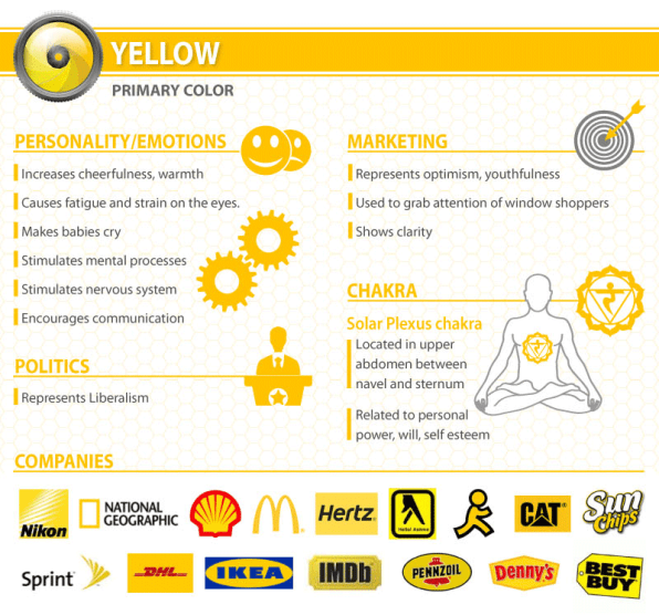
Here’s an illustration that shows colors and the emotions they’re associated with:

Is the background color of your customer account page pleasing or too harsh to the eye? Is the text color legible? Are customers clicking on certain colors more than the others? Is it the color or an icon that’s making customers not click it? Color psychology can help you answer all these questions and choose your customer account page colors thoughtfully.
What role does color play in branding?
Color has a key role to play in how a brand is perceived. Whether you are a health and wellness brand trying to connect to senior citizens or a fashion brand for the young, you must choose your branding colors based on your target audience. Thought through colors can help you build a brand that relates to its audience.
Color evokes feelings
Colors evoke emotions in us. When we see bright colors, we feel happy. When we see dark and dull colors, it has an adverse effect on our mood. This is no different when we choose brands or shop on our favorite sites. When the colors of your customer account page are pleasant and inviting, your customers will end up spending more time on the page.
Color helps attract target audience
Certain colors such as red, green, orange, and yellow are bright and hence, they help attract attention. Similarly, when colors on your customer account page are attractive, they will help attract your target audience.
Vibrant and bright colors appeal more to younger generations, while neutral colors such as blue, gray, and brown are more appealing to people who are older. One way to choose the colors for your customer page would be based on your brand and the products you sell to your target audience.
It helps brands stand out
Imagine if all brands used the same colors. There would be one thing less unique about them. Consumers will have to try hard to differentiate brands from each other when they see advertisements, or when they visit their websites. Having a dedicated color palette for your brand’s customer page can help your brand stand out from other brands.
It helps improve recall value
When we associate colors to a particular brand, product, person, website, etc. It helps us recall these things better. Colors have an impact on our attention and memory performance.
Research shows that color is an important visual experience for humans and functions as a powerful information channel. The colors you choose for your customer page can increase brand recognition by 80%.
Factors to consider when choosing colors for the customer account page
Your customers/ target audience
To make the customer account page relevant to your customers, you can choose the right type of colors to appeal to them. For example, choose bright colors if your target audience or customers belong to a young age group.
Some customer account page apps enable you to use different colors for different customers. For example, The Man Company that uses Flits customer account page and store credits feature, has given different colors to the pages for the different tiers of their loyalty program. For example, gold and silver colors to the gold and silver tiers.
The color of the navigation bar of the customer account page
The navigation bar on your customer account page is the go-to place for customers that log in. This is where they choose the different features and the actions they want to take. Hence, it’s important to use the right color for your navigation bar. Some tips to help you:
- Choose a color tone that is from the palette you use in the store/ website
- Make sure that the color you pick doesn’t make your customer account page look overly heavy
- Ensure that the text on the tabs stands out on the color and make text legible
The color of the CTA button
One of the most important buttons on any website and any customer page is the call to action (CTA) button. These are buttons that drive customers to take actions that you desire them to take. Color plays a key role in the click-rate of CTA buttons.
One of the most debated subjects is green vs red CTA buttons. Studies found red CTA buttons receive more clicks.

Use the right color for the font
Your customer account page will have a lot of text, too. And you obviously want to make the text legible. Hence, choose the font color wisely. A bad choice of color might make reading the text difficult and adversely affect the customers’ experience.
The color of buttons on the customer account page
Your customer account page will have many different clickable buttons such as ‘Re-order’, ‘Cancel’, ‘Delete item’, ‘Return/Exchange’, etc, depending on the features you decide to include in your customer page.
Most marketers choose orange, green, and red, as these are known to be more attractive, but that doesn’t mean you should blindly pick these colors. You can customize your customer account page based on what’s relevant to your customers.
Here are some tips:
- Use a button color that stands out within your Shopify customer account page and nudges customers to click – for eg. the ‘reorder’ button – you want them to click on it
- Pick a contrasting color, but make sure it’s from your brand color palette
Colors and their associations
Red: In marketing, red has been known to be used to create urgency. You might remember seeing red in communication of flash sales and discounts. It is one of the most attractive colors associated with strong emotions such as love, fear, fire, intensity, etc.

Yellow: Yellow is considered a youthful, energetic and positive color. In marketing, it helps attract the attention of shoppers. Yellow also encourages communication.

Green: Green is associated with relaxation, freshness, and coolness. Brands that are associated with food, organic products, environment, and wellness often use the color green on their website and customer account page.

Blue: Most commonly associated with coolness and calmness, the color blue is often seen used by brands in the finance, auto, and social media sectors. Think Facebook, Twitter, LinkedIn, Vimeo, Flickr, and Skype – they’re all blue. Blue is said to create a sense of security and trust.

How are you going to color your customer account page?
The color you use on your customer account page has a huge impact on the performance and conversion rate on your website.
And to customize your customer account page for maximum results, you need a powerful editor. Flits is a customer account page app that equips with everything you need to set up a powerful customer account page on your Shopify store.
Install Flits Customer Account Page App On Your Shopify Store Today!


